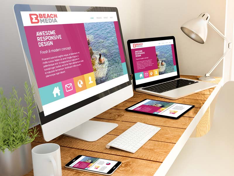
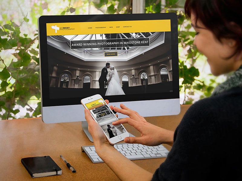
Fresh ideas with new directions of web design are already changing the usual experience of using sites, affect the industry of sales and marketing. What today should be considered when creating a website design in the first place? What to pay attention to?
To make a decision – stay or leave the site, it takes an average of 8 seconds. During this time the visitor should notice on your resource something remarkable and intriguing, prompting him to continue or return next time.
Custom expectations
Design involves the user in the sphere of friendly website design – this greatly facilitates the perception and understanding of content. Any visual information (headings and signatures), all content (text and graphics) must be obvious and understandable. The user does not want to understand the features of your site, when such a site will seem more convenient to him.
However, this “simplicity” should not make design ordinary, boring or “like that” site / blog. Create a good UX, far from an easy task. After all, the uniqueness of design, the very idea of the site and its content – the first requirements of search engines. The ideal design solution will be a uniquely drawn layout of the site.
Content uniqueness and efficiency
Competently selected authors’ materials (not copied or combined) are the basis of quality content. Whatever seo-methods of promotion in the future will not be used, visitors to the web page by their behavior will show how interesting it is to them.
Informative articles with unique content best influence on behavioral factors. Interesting content saves from getting under the wording favorite by search engines: little useful for users.
Navigation
Navigation of the site and its structure is another vital aspect. Inexplicable and difficult navigation, errors in the design of the site’s menu and the dumping of links increase the failure rate. The rules of good usability welcome the use of tabs.
This is a great way to tell users where the information they need is located and when to submit more content in the seconds. User expectations for good usability will be met. It is not necessary to build a complex (multi-layered) structure with nested links. Organize access to content with a minimum of clicks from the home page (3 click rule).
Rule 8 seconds
The overall impression of the site created during these seconds is crucial. Brutal truth of web design – long efforts spent on the development of the site easily fail within 8 seconds.
If you understand the mindset of your visitors (customers), know the cause of failures, and understand the essence of the problematic issues – you have a chance to “sudden insight”. Use it to build an online strategy that leads to a stable flow of clients and visitors.
Website information content
Visitors tend to get certain results of their visit. If the site provides the necessary information, the information consumer achieves the goal. Initially, it takes a few seconds and without meeting this limit, the user leaves the site.

Consider such an aspect as the location of information on the site. Even the data that meets the interests of the visitor, may be useless in cases of their uninformative, unattractive, etc.
For example, a person is interested in holidays in Spain and your website shows him the best places:
- Mallorca
- Tenerife
- Ibiza
- Lanzarote
Despite the correspondence of what the potential client wants (text relevance), this list cannot be called informative. The visitor will remember the location and return to the search, and the search engine will take it as their disapproval of your content.
How to avoid negative factors? For the selected topics of the site should be used: images, interesting descriptions and other advanced information. Try to reveal the characteristics, providing original media files, etc. materials, in a word – quality content.
A more appropriate option (with interesting thematic content):
- Mallorca
- A compact description, for example: “Fine golden sand and delightful sunsets, starry nights, unique spectacles await your arrival. In the bay, you can anchor and enjoy swimming in the purest water against a backdrop of fascinating landscapes of the island …”.
- Local attractions
- This season’s weather information
- Fun activities
- Tips on airline tickets, hotel discounts, choosing a good time for it
- Booking information, tours for sale
Perfect images
Pictures attract attention and this fact should be used to overcome the rule of 8 seconds. Please make sure that your images are relevant to the topic Web document, for example:
See the image with an irrelevant title. Extremely unfortunate step, undermining the trust of customers. Images should be directly related to the subject matter involved, have comparable significance of information size.
Too large images force the user to scroll through a mass of pixels; in addition, such large images slow down page loading, make navigation and viewing more difficult.


