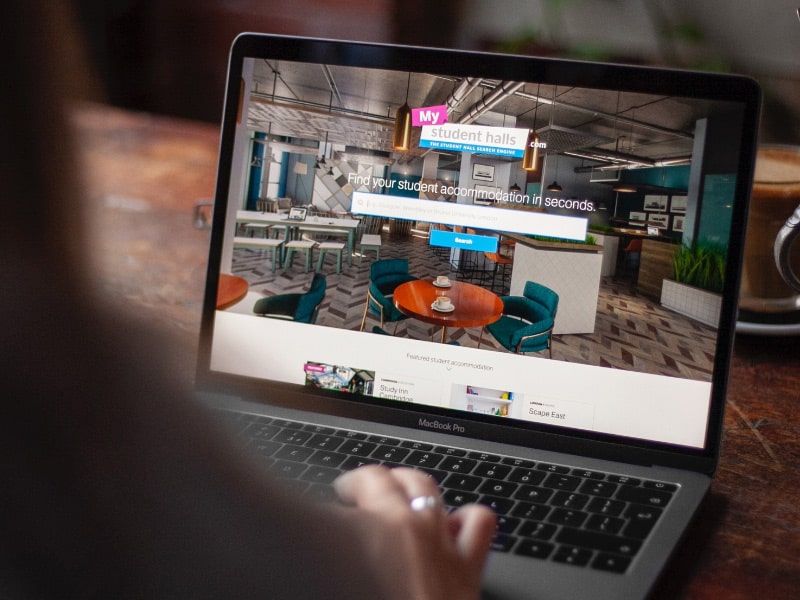
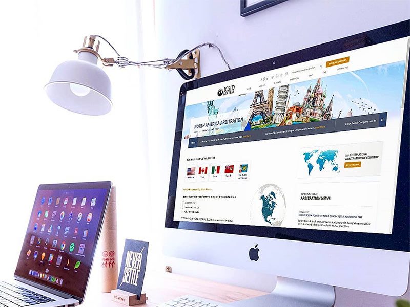
To develop a website with some text, images and a table. He usually treated school projects in the following way: at first he forgot about them, but when the deadline came, he made them at the very last moment. However, at that time, everything was quite different.
He was particularly interested in what his first site would look like. Then, in order to make everything as it should be, he made every effort. The author of the material says that, since ancient times, he sought to ensure that what he does, would look as attractive as possible. It’s an aspiration still alive in him. Here he wants to share some tips on web page design.
Design
You can admit it, you can’t admit it, but people judge anything by what it looks like. If what you are doing looks good, then the chances of your project to gain the trust of others increase, of course, if the word “good” can describe not only its appearance, but also functionality.
I’ve been creating various projects of my own for many years and during this time I’ve paid more and more attention to the development of my design skills, not just to improving my programming skills.
Code is important, but if you want to create your own profitable project, you will have to solve a lot of tasks, one of which is design. A single developer has to develop himself comprehensively in order to achieve something.
A great design is something that can put together a bunch of likes on Dribbble. This is something that is not even noticed at first. It is a balance between extreme simplicity and something that is breathtaking. Design can be both a competitive advantage of a project and one of the reasons for its failure.
It’s not about talent.
When I was younger, I used to play a lot of Meincrafts. I looked at the beautiful things that others created, but when I tried to build something of mine, it was like a box. No beauty, no style. And how can you even make something beautiful in Meincraft?
Then I found a video blogger on YouTube and built a copy of what he was building. A few weeks later, I formed my own style and could create something of my own. Suddenly, my designs stopped looking like something I didn’t understand. What can I say, I even won one contest.
As a matter of fact, I told this story to the point that design is a skill, and as with any other skill, design can be learned.
Selection of tools
In programming, you can take an ordinary Notepad and write with it an application that is as good as the one created with the powerful IDE, although programming in Notepad may not be the most enjoyable activity, and it is likely to take much longer to develop than using the right tools.
When it comes to web design, MS Paint can play the role of Notepad, and I hope that, as in the example of Notepad and programming, very few will use it for design tasks.

Here are some popular tools for web design:
- Sketch is a tool designed exclusively for MacOS. If you draw a parallel with the world of web programming, it will be something like React for design. There is a feeling that the mention of Sketch is present in every designer vacancy. This thing costs $99 a year.
- Adobe XD is a free cross-platform tool, which continues the analogy with programming, like Vue. Around Adobe XD is not as big a community as around Sketch, but it is very easy to master this tool.
- Adobe Photoshop is a kind of Swiss knife in the world of design, which everyone knows about and which can be compared to jQuery. You can use Adobe Photoshop for $ 9.99 per month.
It doesn’t make almost any difference if you use Sublime or VS Code. The same can be said about whether you choose React or Vue for interface development. It is a matter of taste. The same can be said about the designer’s tools. Each of them has its own advantages and disadvantages.
I use Adobe XD. The main reason for this choice is cross-platform, as a result I am not a hostage of the Apple ecosystem, as if I had chosen Sketch. In addition, Adobe XD is supported by Adobe, so we can hope that this project will exist for a very long time.
And beginners will be especially pleased that since May of this year Adobe XD can be used for free, although with some restrictions (although they are unlikely to interfere with you anyway).
About the right mood
The main problem that I had to solve as I entered the world of web design was to develop the right attitude. I used to design in the process of website development. I believed that everything just had to be in a certain order. The elements are placed from left to right and from top to bottom. True, this approach is the right way to become a terrible designer.
The design tools force you to work as if each element had an absolute positioning. After clear designs which can be seen in a program code, designs with which the designer operates, can seem disorganised and disorderly.
But you have to accept this. It gives you freedom, an opportunity to change everything quickly and experiment a lot. And this is probably the most important thing, because design is a continuous process. In design, it’s quite expectable that before you get a great result, you’ll have to redo it a lot and change it a lot.


